Dec 31, 2010

Learning from the Big Guys, End-Of-Year Edition

Some of my best landscape design inspirations come from simply walking around in the world. It's also a fantastic education, and you can't beat the price. Here are a few of the lessons I've learned this year — for worse and for better.


The good: at NapaStyle, Yountville
The bad: Carlsbad office park
The just plain stupid: San Mateo mall

Handle your water. Water in the landscape can be a wonderful element to either enliven or calm a space. Unfortunately, from poorly designed irrigation that applies more water to the pavement than the lawn, to poorly conceived drainage that creates safety hazards, there's no shortage of examples of ways we all can handle our water better. My "Worst of the Wettest" award goes to the fountain at an outdoor shopping center in San Mateo. The open, parklike setting is so sunny, so warm, so lush, so… so stupid to create a ramp right up to the water's sparkling edge, then post a "No Water Contact Allowed" sign.


I just hope the tequila was worth it

This used to be a Black Oak

Why bother?
Hedgehogs on parade


Make the right cut. When you put plants in a landscape you're entering into a bit of a contract. They'll provide shade and process carbon dioxide, and you'll give them food, water and a bit of tender loving care every now and then. Unfortunately, too many gardeners — homeowners and municipal landscapers alike — forget the "tender loving care" part, and we wind up with pruning abominations like these. My "Cruelest Cut" award goes to whomever decided California Gray Rush should be pruned into little hedgehogs every winter. (Hint: it's not actually a grass. Let it grow.) It's not fair to the plants, and it's not fair to those of us who have to look at them.


Sculpture at building entry in SF

At UCSF Mission Bay, paving acts as carpet

Look up! No, up!


Where's the magnifying glass?

Lead the way. An entire industry has evolved around "wayfinding" — the art of helping people navigate through complex environments, particularly in urban settings. Personally, I really enjoy when this can be achieved implicitly, with landmarks such as sculpture or variations in paving materials rather than explicit signs. Sometimes, though, signs simply are the best medium for communicating what lives where. But they're pretty useless if they're so tall, and the lettering so small, as to be unreadable. My "Losing Sight of the Destination" award goes to the City of Palo Alto, which installed such signs at major intersections along University and California avenues. Good thing no one goes there anymore.


Emerging from the earth…

… vs. dropped from the sky.

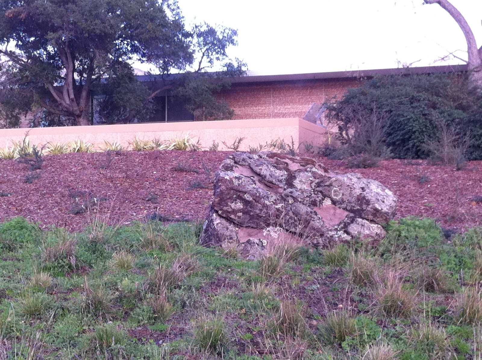
Rock out. Boulders in the landscape are timeless sentinels, a great way to define spaces and make any area feel more natural. They look their best when they seem to be emerging from the earth — I typically specify they be buried to about 1/3 of their height. And bigger is better, perhaps because it seems impossible that such mass could have been placed by man. I was thrilled to see these ginormous specimens going in at the Hewlett-Packard campus at 1501 Page Mill Road in Palo Alto. Too bad some of them didn't go in quite far enough. The groundcover plantings may yet grow up to hide the "taper" at the rocks' bases, so no awards here — yet. But I'm watching.


It's not all bad out there, though. A couple of winners deserve mention:


Acer freemanii 'Autumn Blaze'

Leucadendron species

Muhlenbergia filipes

Go into the light. Especially in the winter when the sun is low and weak, we have lots of opportunities to create stunning effects with plants that either reflect the light or refract it. Palo Alto has been putting in lots of Freeman maples lately, and their color is some of the most brilliant I've seen. Up in San Francisco, this set of Leucadendron from Flora Grubb Gardens positively glows in the late afternoons, as do the massings of Pennisetum and Muhlenbergia grasses at Solage resort in Calistoga. Awards all around for designing with a "light" touch.


How to get air and water to these roots?

Cut a pervious strip into the asphalt

Better still, cut in a lot!

Put down roots. It's not new this year, but I think I'll give my best in show award to the repaved parking lot at Town and Country Village, which has held up extremely well for a few years now. The best part? The permeable "slots" cut into the asphalt, set with interlocking pavers whose gravel-filled gaps allow air and water to reach the roots of the heritage Valley Oak trees that give the property so much character. It's an incredibly simple, yet creative, solution that I haven't seen anywhere else. I'll be "root"ing for its success.


When your eyes are open, it's remarkable how much you can learn from the big guys. Please let me know if you have any lessons to share. And thanks for giving me some of your time this year… here's to continuing our education in 2011!

Dec 20, 2010

A Tree Falls At Facebook

Just up the street from me lives the global headquarters of a little Internet startup named Facebook. The company moved into the former Hewlett-Packard digs at 1601 California last year, making some interesting architectural updates but not really touching the landscape. One of the defining features of the 8.5-acre site was a large Valley Oak (Quercus lobata), which unfortunately was surrounded by lawn for decades. It may look nice and clean, but oaks — even the riparian Valley Oak — and lawns simply aren't compatible. The lawn requires far too much water for the oak's liking, and all that shallow irrigation encourages fungus that stresses, weakens and eventually kills the oak.

Well, Sunday a gust of wind brought the inevitable, and around 10:00 a.m. the tree blew over.

Rotten to the core.
The arborists were still hard at work removing the body some six hours later, and I came by just in time to get a good look at the trunk. I was struck by the amount of rot in the heartwood.

That grayish block just right of center? Concrete.
I haven't counted the rings yet, but the arborists and I guessed the tree was at least 80 years old. It's an ignominious end for such a stately specimen; but are we really surprised? Urban trees are subject to all sorts of ecological insults, from incompatible irrigation to soil compaction, pollution, and sheer human ignorance — the arborist pointed out where concrete had been used to fill a void in the trunk, probably 30 years ago (by the way, please never do this).

There were no outward signs of trouble, and I'm really glad that the huge tree came down on a Sunday morning when the site was largely empty of people. But it is a cautionary tale: if you have a special tree on your property, care for it. Also, cherish it. I don't know how much the Facebook folks appreciated this tree, but it would have been the perfect social hub if the social network had simply pulled out that lawn, put in a more compatible landscape, and added a few benches and tables.

And finally, if you've got a specimen like this in your neighborhood, document it: I was surprised by how few photos I could find of this tree. (The first one above is from Google's "street view.") It's a reminder that nothing lasts forever, and some day we'll want to remember the tree that was.

Nov 15, 2010

Learning from the Big Guys, Pt. 5


Warms the soul, sparks the imagination.
Visiting places that have spent a great deal of money on their grounds is a perfect opportunity to see up close the best and the worst of landscape planning, and to continue learning from the big guys. 

At one very chic, eco-conscious and rustically contemporary (is that a style? it is now) Napa Valley resort lives this charming concrete fire pit. This hearth is the heart of the outdoor "foyer" at the spa area; it is in the middle of a pathway, with no seating around it, so I'm guessing its purpose is not so much for literally warming oneself as for symbolizing the inner warmth the spa services nurture and awaken. I have a minor quibble with this — lowercase 'q' — because frankly, I enjoy sitting around a fire, and can't do that here without perching somewhat awkwardly on the narrow edge of the wall. (A typical depth for a seatwall would be about eighteen inches, to fit most posteriors comfortably; this is about six inches deep.) On the other hand, this might be intentional, to subtly discourage über-relaxed and probably slightly tipsy guests from sitting too close to an open flame. 

What catches me more are a couple of aesthetic issues. I will grant up front that these may have been conscious choices; however, even if they were, I don't agree with them. First, in this clean and contemporary resort there are lots of straight lines, which the fire pit's square shape complements perfectly. The circular fire burner, however, has no precedent that I can see. Granted, the resort's logo is circular, but this is not carried into the architecture or landscape. What's more, the circle-within-a-square feels busy and disruptive, not calming, to me. A square burner would have been better, and more in keeping with the overall geometry of the place. Funny how such a little detail can have such a big effect.

Section view of a likely form
for the concrete fire pit.
Second, I noticed the horizontal seam about six inches above the pavement, about twelve inches below the top of the wall. This pit is solid concrete, which would have been poured into a "form" comprised of an inner wall and outer wall. Most likely, each wall was constructed of one 2x12 board stacked on top of another to achieve a height of about eighteen inches above the concrete pavement (as shown in my little sketch). The seam probably resulted where the concrete oozed between the boards, as very heavy sludge is wont to do.

Now, forming concrete is a talent I certainly do not possess. But the location of this seam annoys me. Could it have been a conscious design decision? There are other raised planters on the property with the same seam, but other than that I don't see any other precedent for dividing surfaces into 2/3 - 1/3 sections like this. And even if there were precedents, what does it mean? If it were an artistic statement, it should at least be intelligible. So I'm going to guess no, this wasn't an aesthetic choice. I'll guess it was a result of (a) going with the easiest solution to build; or (b) miscommunication between the landscape designer, who didn't specify how the forms should be built, and the builder, who didn't realize the aesthetic consequences of their methods.

One way to center the seam
If I were the designer, I like to think, I would have realized a seam would be inevitable (because there would need to be at least two rows of boards), and would have specified that the seam be centered on the wall. Yes, this probably would have meant using three rows of boards: a 2x12 top board ripped to be 9" tall (so the seam would be halfway down the 18" face), a 2x12 in the middle, and a 2x3 or 2x6 on the bottom.

This level of detail makes the construction much more complex in the short term. So does custom-fabricating a square burner. But in the long term — and we designers are paid for long-term, big-picture thinking — I think it would be worth it if no guest (not even a nit-picky designer) ever looked at this otherwise wonderful resort's fire pit or planters and thought, "Huh. That's weird."

Nov 4, 2010

Circles and Dots

Recently I delivered the installation plans — hardscape layout, planting plan, lighting plan, the whole set — for a very nice project. This is always a bittersweet occasion: while it's an exciting beginning of the "real" landscaping work, it's also the beginning of the end of my control over the design. From here on, my client will be working more closely with a landscape contractor than with me to define the details of construction, finalize choices for materials and plants, and probably "value-engineer" some changes to the design to make the project more affordable.

Of course, none of this is unexpected, and I am always available during installation to consult on the design's evolution and retain the integrity of its concept. But, even as I rely on experienced contractors who will make my design even better in its execution, I also understand they may lead the homeowner in directions I hadn't anticipated or intended.

Circles and Dots
Out of all the elements of a landscape plan, the plant selections are the most likely to change after the final design drawings have been submitted. Although I usually provide a preview of each specimen and its characteristics before I finalize the plan, often this is the first time the owner has seen all the plants in combination. Sometimes there's too much drama (this conversation usually begins with, "Wowww…"). Sometimes there are too many plants, sometimes too few (as in, "You sure they'll fill in?"). Sometimes, something else has caught their eye since the time they approved the preliminary plant list ("I really liked the Monkey Puzzle Tree I saw at the arboretum, so…").

I'm also keenly aware that most home owners aren't versed in reading planting plans. And despite having sat with my client to review the plans at length, they are after all a roadmap and not a narrative. Once I've left them in someone else's hands, it doesn't take long for all the circles and dots to blur, and the rationale of my excruciatingly considered choices and combinations becomes less apparent.

Aptly-named Miscanthus 'Morning Light'
Furthermore, even though I've checked to be sure all the plants I'm specifying are available at nursery, inevitably by the time planting comes around something has gone out of stock and a substitute will need to be found. I try to ensure the contractor knows to consult with me before any changes are made, but sometimes it's not until I come over to fine-tune the planting layout that I realize that the drama of a backlit Miscanthus has been lost to a common Agapanthus, or a sedge that relishes "wet feet" has been replaced by a lavender that resents it.

In these cases I can plead my case to the owner — you don't know what you're missing! — that plant will never thrive there! — but more often than not, they were fully aware of the change. I've had single plants and entire gardens ripped out and replaced, sometimes days after installation, sometimes months. The reasons vary, but it's always "nothing personal," the owners just wanted to try something different, or their gardener sold them on a different vision, or their tenant wanted lawn on which their dog might conduct business.

It's their home, not mine, and ultimately all I really want is for the home owner to be happy with their landscape. If the changes fail, I know they'll call me back. And even if the garden does get installed precisely per plan, I know that nature will have her way with it and in a few years we'll all share our amazement at how that Miscanthus has grown so much bigger than any of us expected. This is just how landscaping goes, and I've come to not only live with the unpredictability but also learn from it. The circles and dots may be drawn with a pen — but the ink is never permanent.

Oct 23, 2010

Gardening in (or at least with) the Rain

These light, intermittent rains that have been passing through the Bay Area are just what we need for Fall planting. Especially with our infamous clay soils, just this little bit of moisture loosens things up just enough that the nutrient-rich clay particles don't shatter when we dig into them; yet the soil's not so waterlogged that the clay gets compressed and compacted by our work.

This is an ideal time of year to add organic matter (the best "clay buster there is!), whose nutrients and microbes will leach a little deeper into the subsoil with every rain. It's also the best time to get new plants into the ground (particularly California natives), who will use our long, mild winter to develop a robust root system. If you succeed on both counts, your spring garden will be amazingly healthy — and amazing to behold.