Showing posts with label hardscape. Show all posts

Jun 18, 2011

Learning from the Big Guys, Pt. 7

It's been an incredibly busy year so far, leaving me with lots of thoughts swirling around in my head but precious little time to put them in writing. But my daily travels take me past a few examples of poor landscape planning, and I'm never too busy to learn from the big guys. Today we examine some examples of what happens when the age-old rule "right plant, right place" is broken.

It's a great idea to plant tall trees on the south and west sides of a building. They help shade the structure and reduce heating costs, especially in a sun-drenched climate like Palo Alto. It's also a great idea to use native species such as the coast redwood, Sequoia sempervirens. What's not such a great idea is planting a tree that wants to be 100 feet tall beneath eaves that are 40 feet high. Something has to give here, and I'm betting it won't be the building. Anyone want to make odds on how many days before this poorly-planned tree is removed?


 The Palo Alto JCC is a wonderful example of modern urban infill. It's got intimate courtyards and simple but effective stands of plantings that make it a great space for people. Unfortunately, the designers consistently underestimated the demands of the Center's vehicular traffic, specifically the turning radii cars and trucks would need. Perhaps the planners were simply optimistic that the center would attract fuel-efficient small cars rather than large trucks or SUVs; however, even the average minivan (of which the family-oriented Center attracts plenty) is challenged by turns that are too sharp and lanes that are too narrow. As a result, a couple of walls in the parking garage have been damaged by car bumpers, and curbs have had to be cut or removed and reconfigured. Orange safety cones are proliferating, and overall the traffic areas are looking like a patchwork of temporary fixes — except they're not temporary.

Outside, the entry driveway circles around a center median that is not contained by a raised curb. On the one hand, this is useful because it allows the median to receive stormwater from the surrounding pavement, an effective environmental strategy (the Center earned LEED Silver certification). On the other hand, the absence of a curb means that vehicles can — and do — cut the turn and drive through the planter. This means more orange cones, and a chronically muddy mess that always seems to hold standing water. It's too compacted to sustain plants, and they'd probably get driven over anyhow. The lesson here? Turns require far larger radii than we may think: at least 15-20' inside radius for a passenger car, more for service vehicles such as delivery trucks, and a correspondingly large outside radius so the front outside corner of the vehicle's bumper can sweep through the turn without hitting tangential walls or parked cars or people. If you've absolutely got to have a tight turn without a curb, at least don't put plants inside the curve — use paving stones or some other material that can take the abuse.


Speaking of cars and people, it's always useful to remember that people get into and out of vehicles, and enjoy a bit of clear space in which to do so. This isn't exactly a "big guy," but it is a useful reminder that heavily armed plants such as Agaves — as well as spiny Berberis, Pyracantha and roses, and even sharp-foliaged plants such as Mahonia and Picea (spruce) — make great barriers but usually aren't great selections for a space where people or pets will be passing close by. On the other hand, though, I'd wager this tree hasn't suffered a door ding or the indignity of dog pee in years, so maybe this planting strategy is genius after all — "right plant, right place" doesn't always mean what we think. 


Dec 31, 2010

Learning from the Big Guys, End-Of-Year Edition

Some of my best landscape design inspirations come from simply walking around in the world. It's also a fantastic education, and you can't beat the price. Here are a few of the lessons I've learned this year — for worse and for better.


The good: at NapaStyle, Yountville
The bad: Carlsbad office park
The just plain stupid: San Mateo mall

Handle your water. Water in the landscape can be a wonderful element to either enliven or calm a space. Unfortunately, from poorly designed irrigation that applies more water to the pavement than the lawn, to poorly conceived drainage that creates safety hazards, there's no shortage of examples of ways we all can handle our water better. My "Worst of the Wettest" award goes to the fountain at an outdoor shopping center in San Mateo. The open, parklike setting is so sunny, so warm, so lush, so… so stupid to create a ramp right up to the water's sparkling edge, then post a "No Water Contact Allowed" sign.


I just hope the tequila was worth it

This used to be a Black Oak

Why bother?
Hedgehogs on parade


Make the right cut. When you put plants in a landscape you're entering into a bit of a contract. They'll provide shade and process carbon dioxide, and you'll give them food, water and a bit of tender loving care every now and then. Unfortunately, too many gardeners — homeowners and municipal landscapers alike — forget the "tender loving care" part, and we wind up with pruning abominations like these. My "Cruelest Cut" award goes to whomever decided California Gray Rush should be pruned into little hedgehogs every winter. (Hint: it's not actually a grass. Let it grow.) It's not fair to the plants, and it's not fair to those of us who have to look at them.


Sculpture at building entry in SF

At UCSF Mission Bay, paving acts as carpet

Look up! No, up!


Where's the magnifying glass?

Lead the way. An entire industry has evolved around "wayfinding" — the art of helping people navigate through complex environments, particularly in urban settings. Personally, I really enjoy when this can be achieved implicitly, with landmarks such as sculpture or variations in paving materials rather than explicit signs. Sometimes, though, signs simply are the best medium for communicating what lives where. But they're pretty useless if they're so tall, and the lettering so small, as to be unreadable. My "Losing Sight of the Destination" award goes to the City of Palo Alto, which installed such signs at major intersections along University and California avenues. Good thing no one goes there anymore.


Emerging from the earth…

… vs. dropped from the sky.

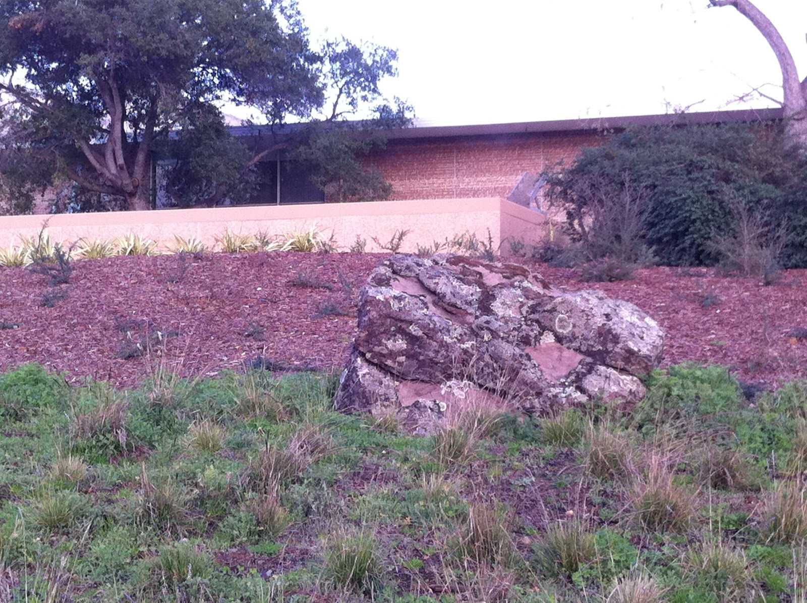
Rock out. Boulders in the landscape are timeless sentinels, a great way to define spaces and make any area feel more natural. They look their best when they seem to be emerging from the earth — I typically specify they be buried to about 1/3 of their height. And bigger is better, perhaps because it seems impossible that such mass could have been placed by man. I was thrilled to see these ginormous specimens going in at the Hewlett-Packard campus at 1501 Page Mill Road in Palo Alto. Too bad some of them didn't go in quite far enough. The groundcover plantings may yet grow up to hide the "taper" at the rocks' bases, so no awards here — yet. But I'm watching.


It's not all bad out there, though. A couple of winners deserve mention:


Acer freemanii 'Autumn Blaze'

Leucadendron species

Muhlenbergia filipes

Go into the light. Especially in the winter when the sun is low and weak, we have lots of opportunities to create stunning effects with plants that either reflect the light or refract it. Palo Alto has been putting in lots of Freeman maples lately, and their color is some of the most brilliant I've seen. Up in San Francisco, this set of Leucadendron from Flora Grubb Gardens positively glows in the late afternoons, as do the massings of Pennisetum and Muhlenbergia grasses at Solage resort in Calistoga. Awards all around for designing with a "light" touch.


How to get air and water to these roots?

Cut a pervious strip into the asphalt

Better still, cut in a lot!

Put down roots. It's not new this year, but I think I'll give my best in show award to the repaved parking lot at Town and Country Village, which has held up extremely well for a few years now. The best part? The permeable "slots" cut into the asphalt, set with interlocking pavers whose gravel-filled gaps allow air and water to reach the roots of the heritage Valley Oak trees that give the property so much character. It's an incredibly simple, yet creative, solution that I haven't seen anywhere else. I'll be "root"ing for its success.


When your eyes are open, it's remarkable how much you can learn from the big guys. Please let me know if you have any lessons to share. And thanks for giving me some of your time this year… here's to continuing our education in 2011!

Nov 15, 2010

Learning from the Big Guys, Pt. 5


Warms the soul, sparks the imagination.
Visiting places that have spent a great deal of money on their grounds is a perfect opportunity to see up close the best and the worst of landscape planning, and to continue learning from the big guys. 

At one very chic, eco-conscious and rustically contemporary (is that a style? it is now) Napa Valley resort lives this charming concrete fire pit. This hearth is the heart of the outdoor "foyer" at the spa area; it is in the middle of a pathway, with no seating around it, so I'm guessing its purpose is not so much for literally warming oneself as for symbolizing the inner warmth the spa services nurture and awaken. I have a minor quibble with this — lowercase 'q' — because frankly, I enjoy sitting around a fire, and can't do that here without perching somewhat awkwardly on the narrow edge of the wall. (A typical depth for a seatwall would be about eighteen inches, to fit most posteriors comfortably; this is about six inches deep.) On the other hand, this might be intentional, to subtly discourage über-relaxed and probably slightly tipsy guests from sitting too close to an open flame. 

What catches me more are a couple of aesthetic issues. I will grant up front that these may have been conscious choices; however, even if they were, I don't agree with them. First, in this clean and contemporary resort there are lots of straight lines, which the fire pit's square shape complements perfectly. The circular fire burner, however, has no precedent that I can see. Granted, the resort's logo is circular, but this is not carried into the architecture or landscape. What's more, the circle-within-a-square feels busy and disruptive, not calming, to me. A square burner would have been better, and more in keeping with the overall geometry of the place. Funny how such a little detail can have such a big effect.

Section view of a likely form
for the concrete fire pit.
Second, I noticed the horizontal seam about six inches above the pavement, about twelve inches below the top of the wall. This pit is solid concrete, which would have been poured into a "form" comprised of an inner wall and outer wall. Most likely, each wall was constructed of one 2x12 board stacked on top of another to achieve a height of about eighteen inches above the concrete pavement (as shown in my little sketch). The seam probably resulted where the concrete oozed between the boards, as very heavy sludge is wont to do.

Now, forming concrete is a talent I certainly do not possess. But the location of this seam annoys me. Could it have been a conscious design decision? There are other raised planters on the property with the same seam, but other than that I don't see any other precedent for dividing surfaces into 2/3 - 1/3 sections like this. And even if there were precedents, what does it mean? If it were an artistic statement, it should at least be intelligible. So I'm going to guess no, this wasn't an aesthetic choice. I'll guess it was a result of (a) going with the easiest solution to build; or (b) miscommunication between the landscape designer, who didn't specify how the forms should be built, and the builder, who didn't realize the aesthetic consequences of their methods.

One way to center the seam
If I were the designer, I like to think, I would have realized a seam would be inevitable (because there would need to be at least two rows of boards), and would have specified that the seam be centered on the wall. Yes, this probably would have meant using three rows of boards: a 2x12 top board ripped to be 9" tall (so the seam would be halfway down the 18" face), a 2x12 in the middle, and a 2x3 or 2x6 on the bottom.

This level of detail makes the construction much more complex in the short term. So does custom-fabricating a square burner. But in the long term — and we designers are paid for long-term, big-picture thinking — I think it would be worth it if no guest (not even a nit-picky designer) ever looked at this otherwise wonderful resort's fire pit or planters and thought, "Huh. That's weird."

Aug 6, 2009

Learning from the Big Guys, Pt. 3

In the previous installment of this series, I wrote about spacing plants appropriately (or not). Courtesy of my commercial neighbors in Palo Alto, here's an example with a smaller species, where tight spacing feels entirely appropriate. River birch in the landscapeBetula nigra, or river birch, is one of my favorite trees — its exfoliating cinnamon bark is visually arresting, and its canopy provides delightful dappled shade. In this cluster, the trees within each trio are planted about 14 feet on center, and the trios are about 19 feet apart. This grove would be a wonderful spot for a bench, fountain, or other lingering point. The biggest downside would be the tree roots: birches are notorious for surface rooting, which can heave a flagstone patio or invade a lawn. Placing a feature inside this grove would be a short-term proposition; and planting these trees close to a hard edge could compromise the hardscaping.

This brings me to another point: when reference books talk about surface rooting — or any characteristic, for that matter — they're not just using up ink. No matter how good your intentions, you will not be the exception to the printed rule. Fraxinus roots invade lawnFor instance, if a tree is reported susceptible to verticillium wilt, and your soil has verticillium fungus, that's not a good tree for you. If a tree is said to grow 40 feet wide, you'll have a hard time keeping it at 20. And if a tree is said to root close to the surface, that's not a good choice next to a lawn, or next to hardscaping. Here's a Fraxinus (ash) that quite owns the lawn around it. It's a big tree, not a bad choice for screening the parking lot from the building, but definitely incompatible with turf. Can you imagine trying to mow around this without scalping the roots? If you were the maintenance crew, wouldn't you stop trying?

So, given that Fraxinus roots do this, would you use the same species as a street tree in a 4' wide planting strip? Fraxinus as a street tree Perhaps it'll be fine, since the roots surface in an effort to find water and the sidewalk offers none. Me, I wouldn't take the chance. And given that this is in Palo Alto, whose choice of Liquidambar as street trees I curse every autumn (usually after twisting an ankle on one of the ubiquitous seedpods), I don't have high expectations.

But I'll keep watch… and learn from the big guys.

Sep 27, 2006

Keeping us together, keeping us apart

How do you use the space between your front door and the sidewalk? Probably the same as your neighbors do, especially if you're in a culturally homogenous area. Here, James Rojas observes Latino Urbanism in Los Angeles:


"Fences: A Social Catalyst
"Fences are a fixed prop. In many front yards across America one can find fences. Most people will build fences for security, exclusion, seclusion, etc. and Latinos build fences for these same reasons. Fences create easily defendable spaces and illustrate a simple, straightforward approach to procession: 'This is my space.' However it's the way Latinos use fences that becomes interesting.

"Waist-high fences are ubiquitous throughout the residential landscape of Latino Los Angeles. The fences function as place to keep things out or in, provide a place hang wet laundry, sell items or just chat with a neighbor. Fences are a useful threshold between the household and public domain and bring residents together. Boundaries bring people together and the fences in Latino neighborhoods define boundaries between public and private space. However here the fences break down the social and physical barriers by creating a place where people can congregate. The middle class suburban neighborhood people rarely congregate in the front yard. This visible expanse of land acts as a psychological barrier that separates the private space of the home from the public space of the street. Collectively the enclosed front yards create a different urban landscape and transform the neighborhood.

"Enclosed front yards help transform the street into a plaza. This new plaza is not the typical plaza we see in Latin American or Europe with strong defining street walls but has an unconventional form. Nevertheless the streets in Latino LA have all the social activity of a plaza. Residents and pedestrians can participate in the social dialog on the street from the comfort and security of their enclosed front yard. Fences clearly delineate their property between neighbors, which allows them to personalize their front yard without physically interfering with each other.

"La Yarda: A Personal Expression
Nowhere else in urban landscape of Latino Los Angeles is the use of space so illuminated and celebrated than in the front yard. Typical middle class front yard is an impersonal space in which no one sits there, no personal objects are left lying while the front yards in Latino LA are personal vignettes of the owner's life. Depending on the practical needs of the owners, the use and design of the front yard vary from elaborate courtyard gardens reminiscent of Mexico, a place for children, to working places. Middle class Americans put their daily habits in the backyard. Latinos bring the party, workspace and conversation to the front yard creating activity in the public space.

"The front yard in middle class suburbs has become a space dedicated to showing that we are good citizens, and responsible members of the community. In Latino LA front yard is not measure by the cosmetics of the lawn but rather your participation in streets activities. The Latino front yards reflect the Latino cultural values applied to American suburb form."

Living in one of the middle-class suburban neighborhoods Rojas describes, I can appreciate how little our front yards are used—which makes it all the more ironic that more often than not, they are comprised mostly of lawn, as though our children will be playing out front while we sip lemonade and chat with our neighbors.

Which is the more human condition: to convene as the community we are, to talk and work and play together despite (or even because of) our fences; or to retreat behind those fences, escaping the masses of people and trite conversation we endure all day in public, pretending that we live apart from and immune to everyone else?

Apr 22, 2006

Ahhh, Bernardus...


I'm off relaxing at my favorite local getaway, Bernardus Lodge in Carmel Valley.

Every time I come here--and it's approaching 10 visits in the last four years--I am awed and inspired by the landscape architecture. Designed by Jack Chandler, it is as timeless as it is tasteful... even as the plantings have been evolved over the years, it still retains a classic beauty. This is a testament to what a well-thought-out landscape should be: not so much a statement of ego as an evocation of place.

As enamored as I am with the planting plan, perhaps my favorite piece of architecture here is the fireplace sited at the center of the social areas. Even when it's not in action, it's a gorgeous anchor; and at night, it is rarely enjoyed by fewer than half a dozen people.

By some standards, the resort's design is conservative; but by mine, it's a perfect blending of ancient and contemporary--and most importantly, it is well liked and well used. Come down some time, and be inspired yourself!