Dec 31, 2010

Learning from the Big Guys, End-Of-Year Edition

Some of my best landscape design inspirations come from simply walking around in the world. It's also a fantastic education, and you can't beat the price. Here are a few of the lessons I've learned this year — for worse and for better.


The good: at NapaStyle, Yountville
The bad: Carlsbad office park
The just plain stupid: San Mateo mall

Handle your water. Water in the landscape can be a wonderful element to either enliven or calm a space. Unfortunately, from poorly designed irrigation that applies more water to the pavement than the lawn, to poorly conceived drainage that creates safety hazards, there's no shortage of examples of ways we all can handle our water better. My "Worst of the Wettest" award goes to the fountain at an outdoor shopping center in San Mateo. The open, parklike setting is so sunny, so warm, so lush, so… so stupid to create a ramp right up to the water's sparkling edge, then post a "No Water Contact Allowed" sign.


I just hope the tequila was worth it

This used to be a Black Oak

Why bother?
Hedgehogs on parade


Make the right cut. When you put plants in a landscape you're entering into a bit of a contract. They'll provide shade and process carbon dioxide, and you'll give them food, water and a bit of tender loving care every now and then. Unfortunately, too many gardeners — homeowners and municipal landscapers alike — forget the "tender loving care" part, and we wind up with pruning abominations like these. My "Cruelest Cut" award goes to whomever decided California Gray Rush should be pruned into little hedgehogs every winter. (Hint: it's not actually a grass. Let it grow.) It's not fair to the plants, and it's not fair to those of us who have to look at them.


Sculpture at building entry in SF

At UCSF Mission Bay, paving acts as carpet

Look up! No, up!


Where's the magnifying glass?

Lead the way. An entire industry has evolved around "wayfinding" — the art of helping people navigate through complex environments, particularly in urban settings. Personally, I really enjoy when this can be achieved implicitly, with landmarks such as sculpture or variations in paving materials rather than explicit signs. Sometimes, though, signs simply are the best medium for communicating what lives where. But they're pretty useless if they're so tall, and the lettering so small, as to be unreadable. My "Losing Sight of the Destination" award goes to the City of Palo Alto, which installed such signs at major intersections along University and California avenues. Good thing no one goes there anymore.


Emerging from the earth…

… vs. dropped from the sky.

Rock out. Boulders in the landscape are timeless sentinels, a great way to define spaces and make any area feel more natural. They look their best when they seem to be emerging from the earth — I typically specify they be buried to about 1/3 of their height. And bigger is better, perhaps because it seems impossible that such mass could have been placed by man. I was thrilled to see these ginormous specimens going in at the Hewlett-Packard campus at 1501 Page Mill Road in Palo Alto. Too bad some of them didn't go in quite far enough. The groundcover plantings may yet grow up to hide the "taper" at the rocks' bases, so no awards here — yet. But I'm watching.


It's not all bad out there, though. A couple of winners deserve mention:


Acer freemanii 'Autumn Blaze'

Leucadendron species

Muhlenbergia filipes

Go into the light. Especially in the winter when the sun is low and weak, we have lots of opportunities to create stunning effects with plants that either reflect the light or refract it. Palo Alto has been putting in lots of Freeman maples lately, and their color is some of the most brilliant I've seen. Up in San Francisco, this set of Leucadendron from Flora Grubb Gardens positively glows in the late afternoons, as do the massings of Pennisetum and Muhlenbergia grasses at Solage resort in Calistoga. Awards all around for designing with a "light" touch.


How to get air and water to these roots?

Cut a pervious strip into the asphalt

Better still, cut in a lot!

Put down roots. It's not new this year, but I think I'll give my best in show award to the repaved parking lot at Town and Country Village, which has held up extremely well for a few years now. The best part? The permeable "slots" cut into the asphalt, set with interlocking pavers whose gravel-filled gaps allow air and water to reach the roots of the heritage Valley Oak trees that give the property so much character. It's an incredibly simple, yet creative, solution that I haven't seen anywhere else. I'll be "root"ing for its success.


When your eyes are open, it's remarkable how much you can learn from the big guys. Please let me know if you have any lessons to share. And thanks for giving me some of your time this year… here's to continuing our education in 2011!

Dec 20, 2010

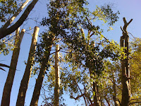
A Tree Falls At Facebook

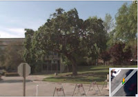
Just up the street from me lives the global headquarters of a little Internet startup named Facebook. The company moved into the former Hewlett-Packard digs at 1601 California last year, making some interesting architectural updates but not really touching the landscape. One of the defining features of the 8.5-acre site was a large Valley Oak (Quercus lobata), which unfortunately was surrounded by lawn for decades. It may look nice and clean, but oaks — even the riparian Valley Oak — and lawns simply aren't compatible. The lawn requires far too much water for the oak's liking, and all that shallow irrigation encourages fungus that stresses, weakens and eventually kills the oak.

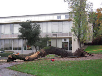
Well, Sunday a gust of wind brought the inevitable, and around 10:00 a.m. the tree blew over.

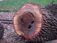
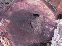
Rotten to the core.
The arborists were still hard at work removing the body some six hours later, and I came by just in time to get a good look at the trunk. I was struck by the amount of rot in the heartwood.

That grayish block just right of center? Concrete.
I haven't counted the rings yet, but the arborists and I guessed the tree was at least 80 years old. It's an ignominious end for such a stately specimen; but are we really surprised? Urban trees are subject to all sorts of ecological insults, from incompatible irrigation to soil compaction, pollution, and sheer human ignorance — the arborist pointed out where concrete had been used to fill a void in the trunk, probably 30 years ago (by the way, please never do this).

There were no outward signs of trouble, and I'm really glad that the huge tree came down on a Sunday morning when the site was largely empty of people. But it is a cautionary tale: if you have a special tree on your property, care for it. Also, cherish it. I don't know how much the Facebook folks appreciated this tree, but it would have been the perfect social hub if the social network had simply pulled out that lawn, put in a more compatible landscape, and added a few benches and tables.

And finally, if you've got a specimen like this in your neighborhood, document it: I was surprised by how few photos I could find of this tree. (The first one above is from Google's "street view.") It's a reminder that nothing lasts forever, and some day we'll want to remember the tree that was.

Nov 15, 2010

Learning from the Big Guys, Pt. 5


Warms the soul, sparks the imagination.
Visiting places that have spent a great deal of money on their grounds is a perfect opportunity to see up close the best and the worst of landscape planning, and to continue learning from the big guys

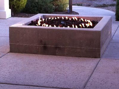
At one very chic, eco-conscious and rustically contemporary (is that a style? it is now) Napa Valley resort lives this charming concrete fire pit. This hearth is the heart of the outdoor "foyer" at the spa area; it is in the middle of a pathway, with no seating around it, so I'm guessing its purpose is not so much for literally warming oneself as for symbolizing the inner warmth the spa services nurture and awaken. I have a minor quibble with this — lowercase 'q' — because frankly, I enjoy sitting around a fire, and can't do that here without perching somewhat awkwardly on the narrow edge of the wall. (A typical depth for a seatwall would be about eighteen inches, to fit most posteriors comfortably; this is about six inches deep.) On the other hand, this might be intentional, to subtly discourage über-relaxed and probably slightly tipsy guests from sitting too close to an open flame. 

What catches me more are a couple of aesthetic issues. I will grant up front that these may have been conscious choices; however, even if they were, I don't agree with them. First, in this clean and contemporary resort there are lots of straight lines, which the fire pit's square shape complements perfectly. The circular fire burner, however, has no precedent that I can see. Granted, the resort's logo is circular, but this is not carried into the architecture or landscape. What's more, the circle-within-a-square feels busy and disruptive, not calming, to me. A square burner would have been better, and more in keeping with the overall geometry of the place. Funny how such a little detail can have such a big effect.

Section view of a likely form
for the concrete fire pit.
Second, I noticed the horizontal seam about six inches above the pavement, about twelve inches below the top of the wall. This pit is solid concrete, which would have been poured into a "form" comprised of an inner wall and outer wall. Most likely, each wall was constructed of one 2x12 board stacked on top of another to achieve a height of about eighteen inches above the concrete pavement (as shown in my little sketch). The seam probably resulted where the concrete oozed between the boards, as very heavy sludge is wont to do.

Now, forming concrete is a talent I certainly do not possess. But the location of this seam annoys me. Could it have been a conscious design decision? There are other raised planters on the property with the same seam, but other than that I don't see any other precedent for dividing surfaces into 2/3 - 1/3 sections like this. And even if there were precedents, what does it mean? If it were an artistic statement, it should at least be intelligible. So I'm going to guess no, this wasn't an aesthetic choice. I'll guess it was a result of (a) going with the easiest solution to build; or (b) miscommunication between the landscape designer, who didn't specify how the forms should be built, and the builder, who didn't realize the aesthetic consequences of their methods.

One way to center the seam
If I were the designer, I like to think, I would have realized a seam would be inevitable (because there would need to be at least two rows of boards), and would have specified that the seam be centered on the wall. Yes, this probably would have meant using three rows of boards: a 2x12 top board ripped to be 9" tall (so the seam would be halfway down the 18" face), a 2x12 in the middle, and a 2x3 or 2x6 on the bottom.

This level of detail makes the construction much more complex in the short term. So does custom-fabricating a square burner. But in the long term — and we designers are paid for long-term, big-picture thinking — I think it would be worth it if no guest (not even a nit-picky designer) ever looked at this otherwise wonderful resort's fire pit or planters and thought, "Huh. That's weird."

Nov 4, 2010

Circles and Dots

Recently I delivered the installation plans — hardscape layout, planting plan, lighting plan, the whole set — for a very nice project. This is always a bittersweet occasion: while it's an exciting beginning of the "real" landscaping work, it's also the beginning of the end of my control over the design. From here on, my client will be working more closely with a landscape contractor than with me to define the details of construction, finalize choices for materials and plants, and probably "value-engineer" some changes to the design to make the project more affordable.

Of course, none of this is unexpected, and I am always available during installation to consult on the design's evolution and retain the integrity of its concept. But, even as I rely on experienced contractors who will make my design even better in its execution, I also understand they may lead the homeowner in directions I hadn't anticipated or intended.

Circles and Dots
Out of all the elements of a landscape plan, the plant selections are the most likely to change after the final design drawings have been submitted. Although I usually provide a preview of each specimen and its characteristics before I finalize the plan, often this is the first time the owner has seen all the plants in combination. Sometimes there's too much drama (this conversation usually begins with, "Wowww…"). Sometimes there are too many plants, sometimes too few (as in, "You sure they'll fill in?"). Sometimes, something else has caught their eye since the time they approved the preliminary plant list ("I really liked the Monkey Puzzle Tree I saw at the arboretum, so…").

I'm also keenly aware that most home owners aren't versed in reading planting plans. And despite having sat with my client to review the plans at length, they are after all a roadmap and not a narrative. Once I've left them in someone else's hands, it doesn't take long for all the circles and dots to blur, and the rationale of my excruciatingly considered choices and combinations becomes less apparent.

Aptly-named Miscanthus 'Morning Light'
Furthermore, even though I've checked to be sure all the plants I'm specifying are available at nursery, inevitably by the time planting comes around something has gone out of stock and a substitute will need to be found. I try to ensure the contractor knows to consult with me before any changes are made, but sometimes it's not until I come over to fine-tune the planting layout that I realize that the drama of a backlit Miscanthus has been lost to a common Agapanthus, or a sedge that relishes "wet feet" has been replaced by a lavender that resents it.

In these cases I can plead my case to the owner — you don't know what you're missing! — that plant will never thrive there! — but more often than not, they were fully aware of the change. I've had single plants and entire gardens ripped out and replaced, sometimes days after installation, sometimes months. The reasons vary, but it's always "nothing personal," the owners just wanted to try something different, or their gardener sold them on a different vision, or their tenant wanted lawn on which their dog might conduct business.

It's their home, not mine, and ultimately all I really want is for the home owner to be happy with their landscape. If the changes fail, I know they'll call me back. And even if the garden does get installed precisely per plan, I know that nature will have her way with it and in a few years we'll all share our amazement at how that Miscanthus has grown so much bigger than any of us expected. This is just how landscaping goes, and I've come to not only live with the unpredictability but also learn from it. The circles and dots may be drawn with a pen — but the ink is never permanent.

Oct 23, 2010

Gardening in (or at least with) the Rain

These light, intermittent rains that have been passing through the Bay Area are just what we need for Fall planting. Especially with our infamous clay soils, just this little bit of moisture loosens things up just enough that the nutrient-rich clay particles don't shatter when we dig into them; yet the soil's not so waterlogged that the clay gets compressed and compacted by our work.

This is an ideal time of year to add organic matter (the best "clay buster there is!), whose nutrients and microbes will leach a little deeper into the subsoil with every rain. It's also the best time to get new plants into the ground (particularly California natives), who will use our long, mild winter to develop a robust root system. If you succeed on both counts, your spring garden will be amazingly healthy — and amazing to behold.

Sep 21, 2010

Space Invaders

Yellow swallowtail
enjoying Buddleja
'Nanho Blue'
One of the greatest benefits of having a National Wildlife Federation-certified wildlife habitat is all the critters it invites: hummingbirds, songbirds, lizards, butterflies, honeybees and newts, just to name a few.

And one of the greatest drawbacks of having a NWF-certified wildlife habitate is, yes, all the critters it invites: squirrels, gophers, raccoons, yellowjackets, ants and rabbits, jut to name a few.

Lately it seems my nice little domesticated yard has been invaded by wildlife. The ants are colonizing the fruit tree containers; the squirrels are busy burying acorns which the scrub jays promptly excavate; the towhees are kicking my mulch all over the place looking for — well, I don't really know. My Cistus and Heuchera are keeling over since they have no roots anymore, courtesy of the aforementioned gopher; and the aforementioned cute and fuzzy bunny has begun nibbling the Anigozanthos, which is just not cool.
Towhee. So cute. Such a kick.

But this is just how it goes in nature, the joy and the pain of gardening. It's not limited to animals, either: I was amused by the latest issue of Fine Gardening, which on one page explores Connecticut nurseries' self-imposed ban on invasive Berberis, while another page extols the virtues of Berberis among mixed grasses. That article also celebrates Verbena bonariensis' ample reseeding, as in "you'll always have more." But wait: couldn't that be a wonderful euphemism for "invasive"? Apparently we cannot both have our Nasturtium and eat it too.

I've long believed that gardens are chaotic systems, hurtling toward disorder, their entropy both restrained and hastened by our best attempts to own them. I use Berberis all the time for its fall color, its spines, its berries — it is a fantastic ornamental plant for a wildlife habitat. At least, around Palo Alto. In Connecticut, not so much.

Grrrr.
For those of us who feel closely connected to nature, watching this chaos is mesmerizing. We observe the long-term interplay between plants, soil, climate, humans, and other creatures; and find that how we relate with each of these elements defines our relationship with the total landscape. Did they invade my space? Or I theirs?

Whatever that relationship, though, the more we observe, the more wonder we get to experience; and the more we marvel at the life force that can create such a beautiful mess.

Sep 15, 2010

Hurry Up and Wait

In my last post I promised to review the more landscape-relevant features of Vectorworks Landmark 2010. Since then, the company has not only changed their name to Nemetschek Vectorworks Inc., they've also released Vectorworks 2011, including more robust 3D features as well as scalable symbols — one of the features I really missed from previous versions. So rather than continue looking back at 2010, I'll use a future post to look forward to 2011. If there's a feature you'd particularly like me to explore, please let me know. Thanks!

Jul 23, 2010

Reviewing Vectorworks Landmark 2010 - Part One

©Nemetschek NNA
It's been about nine months since the good folks at Nemetschek sent me an evaluation copy of Vectorworks Landmark 2010. Rather than rush to conclusions, I've used the time to put the program through its paces in a variety of real landscape design projects, and over the next several posts I'll share my experiences. This series is written for the landscape designer who has some experience with CAD and other digital production tools, and is considering purchasing Vectorworks or upgrading to v2010. It's definitely not a tutorial, a treatise on CAD, or a technical analysis. (Frankly, some of my frustrations with the program probably stem from the fact I'm running it on my MacBook Pro, not an optimized workstation.) It also is not an exhaustive review, of which there are several already. Instead, it's a quick look into one possible way of using Vectorworks Landmark to make your landscape design process just a bit more efficient. If you use it differently, or feel I should, I would love to hear from you.


In this first installment, I'll look at the most basic basics of working with Vectorworks Landmark 2010: setting up documents, organizing your work, and drafting basic 2D forms.

The primary reason I began working with Vectorworks Landmark (which I'll call VW) five years ago was that it was the most robust CAD program available for the Mac, and this hasn't changed. The industry standard, AutoCAD, still isn't Mac-compatible; but VW can both read from and write to DWG/DXF formats, and VW2010 has only expanded this compatibility. For some designers, this is reason enough to use VW: it has the power of AutoCAD, with the friendliness of Mac. Actually, the only AutoCAD feature I really miss in VW is the ability to define block attributes, to create editable text templates. (If you don't know what I'm talking about, you probably won't mind the omission.)

Since it has such strong roots in the Mac's graphical interface, using VW has always been very intuitive for me. Open up a new document, and almost immediately it's obvious how to begin drafting. Tools can be selected either from graphical palettes which can be "torn off" and placed anywhere on the screen, or by customizable key commands. Better still, your entire working environment can be customized -- including which tools appear on which palettes, how your cursor behaves, default line weights, and so on. In fact, there are so many ways to customize your workspace, VW has had a hard time consolidating preferences. As a result, it's hard to keep track of what lives where: dashed-line styles are in the File>Document Settings menu, while line weights are in the Tools>Options>Line Thickness menu. Cursor appearance is controlled from either the Vectorworks>Preferences menu or the Tools>Options>Vectorworks Preferences menu; but cursor behavior — e.g. snapping to endpoints, constraining to angles, showing extension lines from reference points — is in the Tools>Options>SmartCursor Settings menu. I love being able to hack almost every aspect of the program, but I'd also love to see these controls organized more logically.

Save time: select like objects at once.
It probably is most efficient to begin from a template document including your customized workspace, key commands, style standards, frequently used plant and other symbols, object classes, and sheet and design layers. In practice, though, I usually wind up starting with an existing client file and doing a "Save As…" to make a new document. Sometimes this results in strange behaviors, such as broken resource links, and VW makes it very easy to renew the link, change it, or delete the resource entirely. One of my favorite new features is the "Select Similar" tool, which allows me to select objects of like size, shape, color, line weight, opacity… any combination of 27 different criteria in all. This is a massive time-saver when I want to, say, delete all the boulders in a design, or increase the line weights of all my trees, or make all the guidelines on one particular design layer visible.

Speaking of design layers, if you're an AutoCAD user you might not be sure what I'm talking about: you're accustomed to drafting mostly in "model space," producing sheets in "paper space," and assigning objects to "layers" with unique attributes and visibilities. Be forewarned that VW uses a different (and, to my mind, more accurate) parlance to organize your work: drafting happens mostly in "design layers," sheet production happens in "sheet layers," and objects are assigned to unique "classes." Like AutoCAD, though, VW does use "viewports," and has the ability to reference external drawings (even though VW doesn't call it XREF). I do know designers who do all their VW drafting to scale on sheet layers; I truly don't understand this, as VW allows so much more flexibility when you commit to using design layers, classes and viewports (plus, the learning curve to master them is so blessedly short). Best of all, VW makes it easy to save sets of classes and layers as defaults, so your trusty favorites are right there whenever you start a new document. I won't go into detail here on how I structure layers and classes in my files, except to say that I like to parse them as finely as possible for maximum control over the appearance of my plans. If you'd like to know more, feel free to write me.

Organizing with layers & classes makes presentation infinitely easier.
Drafting in VW is exceptionally easy. A house footprint, for example, can be created as a series of discrete lines, as a single polyline with multiple corner points, or even as a series of intersecting rectangles combined into a single shape (i.e. with their overlapping areas removed). No matter which method you choose, the lines can then be converted to a VW wall object, with depth, height and the ability to have predefined door and window objects inserted. Although it's a bit of overkill for a landscape plan, it takes so little extra effort beyond the creation of the original polygon that I almost always draft structures this way. Curved shapes are only slightly more difficult: you can begin with a circle, a regular arc, or a polyline with Bezier, cubic or arc vertices. Any of these can be decomposed into their constituent segments, for additional editing or conversion to a VW object such as a wall, property line, or landscape or hardscape area. (The landscape/hardscape area is a nice touch, and improved for 2010: you can assign materials, patterns and unit costs and VW will help calculate square footage and total costs.) Also new in VW2010 is a feature AutoCAD users have enjoyed for some time: the ability to start drawing an object with a mouse click, then key in dimensions to have it completed automatically.
©Nemetschek NNA

Someone wrote that AutoCAD basically draws lines, while VW basically draws shapes. It's a convenient distinction, and anyone familiar with Google SketchUp will know how much faster it can be to define a rectangle than to draw four lines at right angles. VW now provides four ways to draw a rectangle; six ways to draw a circle; two oval modes; regular and irregular polygons; polylines; spirals; and even freehand lines with varying degrees of smoothness. Again, any of these can be decomposed into segments and edited, or converted to objects, or spliced together or intersected to make complex forms. I have yet to hand-draft a line or shape that I couldn't replicate in VW — however, as with most digital tools, this demands a fair investment of time, so it's usually not appropriate in the early stages of design. The new version offers a plethora of "smart" drafting aids, such as snapping to points, edges, vertices and predefined angles; zooming into the spot you're drafting; and varying degrees of visual cues such as highlighting snapped objects and available points. Again, these aids are customizable to a fault, and I found them useful when I was getting to know the program but now have them disabled to reduce the "visual noise" in my workspace.

In my next post I'll explore the more landscape-relevant features of VW Landmark 2010, including dimensions, plant libraries and symbols. In the meantime, if your appetite is whet I would recommend diving into (a) the Vectorworks website, for descriptions and demonstration videos; (b) the Vectorworks user board and/or the VectorWorking community, which contain lots of tips as well as insights into what problems people are having; and (c) the undisputed champion of Vectorworks third-party support, Jonathan Pickup and his Archoncad site. And as always, if you have questions or corrections on what I've written here, please give me an earful.

Jul 8, 2010

Choosing the Right Designer for You

As my voicemail fills with eager requests for landscaping ideas before summer slips away, here's some wisdom from a few years back that bears re-posting.

I'm often asked what my style of design is. It's a bit of a pat answer to say "your style," but it's not far off.

After all, no landscape designer worth their soil is so inflexible they can't work with more than one kind of client or architecture. And a really good designer will be part researcher, part psychologist and part psychic as well, so that we know our client really well -- so well that we can deliver unique ideas and solutions that may be unexpected but are never unwelcome.

So how can you know whether a given landscape designer is a good fit for your property?
1. Don't pick an "English country" designer just because you have a Tudor-style home. In the first place, you'll be limiting your design options, perhaps unneccessarily. (See #2, below.) In the second place, a designer who specializes exclusively in one genre like this probably would offer you the same palette of plants and cookie-cutter look as their last customer. (The notable exception may be designers such as Indig Design who specialize in native plant communities... not an aesthetic style as much as an ecological one.)

2. Unless you give very clear-cut and detailed direction, don't put too much stock in the designer who, on first sight, knows "exactly how" they would design your garden. Intuition and vision are wonderful, and certainly first impressions last. But anyone who weds themselves to a single idea without doing a bit of reconaissance on your property and developing alternative designs is missing the details that will make your garden truly yours over the long term.

(2b. If you do have very clear-cut and detailed direction, you may want to simply hire a contractor and skip the design phase. You'll have more money to allocate to construction, and you'll be able to move forward with your project faster.)

3. Don't pick a designer just because theirs is the biggest ad in the phone book or at the top of the search engine ads. That's only an indicator of how much advertising they do; it tells you nothing about the process or quality of their work.

4. Do retain the designer that your friends, neighbors, or trusted associates are raving about. Even if their home looks nothing like yours, the raves probably are for how the designer handled the project -- process, fees, attention to detail, communication -- as much as for the finished look. Websites like Yelp can be helpful here as well.

5. Do retain the designer who asks about and understands your budget -- and agrees to work with you anyway. If you have $100,000 - $250,000 to spend on your landscaping, you'll want to make sure you interview designers who are accustomed to budgets (or properties) that size. On the other hand, if you have 1/10 that amount to spend, you'll want to talk with the designer who knows how to make $25,000 look like a million bucks.


6. Do retain the designer who "feels right" to you, regardless of budget or style. You'll be working closely with this person on myriad details, and s/he will need to interpret your wishes, dislikes and personality. If their references check out, if they have creative and practical ideas to offer while respecting your own, if they know their stuff and can communicate it clearly in pictures and/or words, and most importantly if you feel comfortable talking and exchanging ideas with them, that designer will probably be a joy to work with... and your new garden will be a joy to live in.

May 27, 2010

Know Thyself

© Cindy DyerA few weeks ago I had the privelege of being interviewed by one fantastic nature photographer, graphic designer and gardener, Cindy Dyer. The interview touches on some of the "day in the life" stuff that most of my clientele never get to see, and it's receiving some pretty favorable responses.

I'm honored that people enjoy learning about me and my work. The interview was a lot of fun for me, too, because it gave me a chance to reflect more deeply than usual on not only my work but also what inspires me. And a little self-knowledge is a powerful thing.

In the course I teach on Custom Garden Design, the first class is devoted to getting to know yourself better. After all, a garden can't be very personal if you don't know the person. But as I went through a couple of exercises designed to help identify my students' influences and inspirations, I could see eyes glazing over, as if they were terrified to get in touch with anything that might be meaningful for them. One gentleman spoke up: "This is supposed to be a course on garden design. We've been here an hour; are we going to do any garden design?"

I reminded him that the course was on custom garden design. As in, the garden you won't find in the pages of any book or magazine. The garden that fits you like a bespoke suit. If all he needed was to fill a corner of his yard, I offered, he could have spent his money at the local nursery instead of my class. But if he wanted that corner of the yard to be a place that feels like "home," that just seems right whenever he looks at it or sits in it, then he'd better get to know a bit about what makes him tick.

Now, I understand that I'm pretty open to introspection, self-awareness and all that Northern California touchy-feely stuff, maybe more so than a lot of people. But garden planning isn't deep therapy. It shouldn't be threatening or intimidating. Quite the contrary: developing your landscape wishlist should be pleasurable, a mini-vacation as you allow your mind to wander to the places and times that have been most enjoyable in your life. It's a chance to revisit the best parts of your life, and even to imagine places you've never been: I've never dipped a toe in the Caribbean, but I can practically feel the fine white sand under my feet, the gentle breeze cooling my sun-kissed face, the calm warm water caressing my legs. I can smell the coconut (OK, and the rum to go with it), and I can hear the clacking of palm fronds against each other and the warbling of some bird or other. I can tell you, without ever having been there, that the Caribbean would be an intensely relaxing place for me. And if I desire intense relaxation from my garden, I could try to recreate some of these sensory pleasures there.

In design-speak, we say this is part of the design program. The program includes a lot of other, quantitative stuff too: the size and shape of your property, the sun exposure, adjacent conditions such as trees and buildings, budget, timeline, and so on. But your wishlist is a necessary component, for it gives us a goal to strive for. Sure, we probably won't be building a beach in your backyard. But if we can understand what about that beach makes it pleasurable and meaningful to you, then we can be very strategic in our design, and probably create a pleasurable and meaningful environment without a gram of white sand.

I don't know whether my student will be able to dig that deeply within himself. Some of us can't. I do start my clientele off with a questionnaire to begin identifying their wishes and needs, and I also ask them to create (if they haven't already) an "idea file" with magazine clippings, photos, journal writings, whatever might give me that qualitative sense of their preferences and priorities. Even if they don't know what attracts them to a particular garden, I tell them, if I have enough data to work with, I can connect the dots and synthesize a design direction.

If you've ever tried one of those one-size-fits-all plant combinations from a book or magazine, chances are it hasn't lived up to your expectations. It's not your fault! You simply may have been starting at the end of the design process, instead of the beginning. Get to know yourself a bit better, and your garden will be the better for it.

May 13, 2010

Two Roses for the Price of One

So your rose bush is blooming magnificently. Bright, big flowers… glossy green leaves… gosh, it's doing so well it's actually blooming in two colors this year!

Uh… not actually.

In fact, if your rose bush is blooming in two colors, I'll wager that one of them is a deep maroon, a little smaller than the other, a little lower on the bush. Probably a little something like this:

If so, you don't have one rose flowering in two colors: you have two roses.

See, most roses sold and planted in California are hybrids — genetic crosses between two different varieties. Not at all Frankenflowers, they're bred this way to give us distinct joy: brighter flowers, glossier leaves, repeat flowering, greater resistance to disease. You can't have it all, though, and what makes them beautiful upstairs makes them weak downstairs.

Enter that miracle of modern ancient technology, grafting. By splicing that gorgeous body onto robust roots that can handle frost, rot, nematodes, fungus, drought, etc., humans figured out that we can have it all.

The only problem, and it's really just a minor one, is that those roots are — by definition — more robust than the body. And just like the body, their prime directive is to grow. Which means you get robust growth… just from the rootstock, not the body.

So those smaller, maroon flowers are "suckers" growing from the rootstock, most likely a variety named "Dr. Huey" (named after a prominent early-1900s rosarian) that is used for almost all California-grown hybrid tea roses because it can handle poor soils, shade, cold, and disease (although it has shown some susceptibility to nematodes in Florida).

Unfortunately, although "Dr. Huey" is beautiful in its own right, if left unchecked its vigor will sap the plant's energy from the more desirable body, the one you presumably bought the plant for in the first place. To prevent this fate, prune the suckers back as close to the primary cane as possible. This directs all that vigor back into the body of the bush… so it can bloom magnificently after all.

May 4, 2010

Learning from the Big Guys, Pt. 4

(By the way, I had nothing whatsoever to do with this combination of 'St. Josephs Coat' rose, unspecified iris, and Cerastium tomentosum… I saw it last week in a Los Altos front yard, and it just makes me happy.)

I've written before about learning from the big guys, but sometimes we can learn from the little guys, too — particularly when they make mistakes that, although not big in an absolute sense, are relatively huge.

I met recently with a Palo Alto homebuilder of considerable repute, who had endured what he deemed a "terrible" experience with a garden designer who also is a licensed landscape contractor. Hoping to learn from her missteps, I pressed him on what had gone so wrong. It boiled down to essentially three sins:

One, she didn't take direction. "We would make changes to the plan," the builder said, "and the same things would show up in the next revision." To me, it sounded like a rookie mistake: confusing your own interests with the client's. I'm not saying the client's ideas are always right; but their interests are.

Two, the designer's ideas were weak. Perhaps she threw them together hastily, perhaps she went with her first thought instead of developing more concepts and challenging her own limits. Perhaps she wasn't paid enough to put adequate time toward concept development. I don't know. I wasn't there. But none of those is a good excuse for faulty logic or cookie-cutter designs.

Third, she overstepped her role. Assigned to develop a pathway, she reconfigured the front porch as well. (This upset the architect considerably.) Given a budget and scope of work by the builder, she "added value" with elements that were integral to the design yet unaffordable. As a contractor herself, the builder said, she should have been able to provide creative alternatives without losing sight of costs.

In fairness, I got only one side of the story. But it's a great cautionary tale regardless. Landscape designers are not fine artists, accountable only to ourselves; we are commercial artists, accountable to our clients (and often serving many clients with a single work). Our creativity is meaningless if we lose sight of its object. And while we're certainly entitled — obliged, even — to stand up for our ideas, we mustn't forget that we do not have to live with our own work.

Having a good idea isn't enough: we must have the right good idea.

Mar 30, 2010

Winter Into Spring

Interesting phenomenon: as soon as we got a few sunny days this month, my phone started ringing off the hook with people who "want new landscaping in time for summer." This actually is typical of this season, as it gradually dawns on us that winter may actually end some day, and we may get to spend some time outside again.

No one wants to defer gratification, or make yet another summer's worth of excuses for the state of their yard. But the rains look like they might be around a while longer, and that saturated muck we call soil is no fun for even the most ardent DIY-er to work with. What's more, by this time of year, the good contractors are booked solid for the spring and into summer.

So what's an impatient homeowner to do?

1. Throw money at it. There's no problem that can't be solved when you multiply your budget 4x. Hey, the markets have been on a roll lately, right?

2. Call a dozen contractors for bids. After all, there's gotta be one that's not booked up. (But, to save time, make sure you don't call any of their most recent customers for references.)

3. Lower your design standards. So what if you really wanted a stone patio and redwood arbor? You'll get used to the gravel in time, and you can probably get a really good deal on a charming patio umbrella on craigslist.

4. Do it yer damn self. Because you're really good at things like this.

5. Start planning now for autumn. Contact a really good garden designer now and commission a unique landscape design, to be installed in the fall. Your preliminary concepts should be done by June. You can start contacting contractors in July. Get final plans and bids by August. And break ground in September. Your plants (installed in October or November) will appreciate all the winter rains, as will your irrigation budget. Your wallet won't get raked over the coals by the laws of supply and demand. And in exchange for your patience and wisdom, you'll have an excellent new landscape, at an excellent price, less than a year from now.

It's not quite instant gratification. But it's probably a result you can live with.