Dec 31, 2010

Learning from the Big Guys, End-Of-Year Edition

Some of my best landscape design inspirations come from simply walking around in the world. It's also a fantastic education, and you can't beat the price. Here are a few of the lessons I've learned this year — for worse and for better.


The good: at NapaStyle, Yountville
The bad: Carlsbad office park
The just plain stupid: San Mateo mall

Handle your water. Water in the landscape can be a wonderful element to either enliven or calm a space. Unfortunately, from poorly designed irrigation that applies more water to the pavement than the lawn, to poorly conceived drainage that creates safety hazards, there's no shortage of examples of ways we all can handle our water better. My "Worst of the Wettest" award goes to the fountain at an outdoor shopping center in San Mateo. The open, parklike setting is so sunny, so warm, so lush, so… so stupid to create a ramp right up to the water's sparkling edge, then post a "No Water Contact Allowed" sign.


I just hope the tequila was worth it

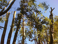
This used to be a Black Oak

Why bother?
Hedgehogs on parade


Make the right cut. When you put plants in a landscape you're entering into a bit of a contract. They'll provide shade and process carbon dioxide, and you'll give them food, water and a bit of tender loving care every now and then. Unfortunately, too many gardeners — homeowners and municipal landscapers alike — forget the "tender loving care" part, and we wind up with pruning abominations like these. My "Cruelest Cut" award goes to whomever decided California Gray Rush should be pruned into little hedgehogs every winter. (Hint: it's not actually a grass. Let it grow.) It's not fair to the plants, and it's not fair to those of us who have to look at them.


Sculpture at building entry in SF

At UCSF Mission Bay, paving acts as carpet

Look up! No, up!


Where's the magnifying glass?

Lead the way. An entire industry has evolved around "wayfinding" — the art of helping people navigate through complex environments, particularly in urban settings. Personally, I really enjoy when this can be achieved implicitly, with landmarks such as sculpture or variations in paving materials rather than explicit signs. Sometimes, though, signs simply are the best medium for communicating what lives where. But they're pretty useless if they're so tall, and the lettering so small, as to be unreadable. My "Losing Sight of the Destination" award goes to the City of Palo Alto, which installed such signs at major intersections along University and California avenues. Good thing no one goes there anymore.


Emerging from the earth…

… vs. dropped from the sky.

Rock out. Boulders in the landscape are timeless sentinels, a great way to define spaces and make any area feel more natural. They look their best when they seem to be emerging from the earth — I typically specify they be buried to about 1/3 of their height. And bigger is better, perhaps because it seems impossible that such mass could have been placed by man. I was thrilled to see these ginormous specimens going in at the Hewlett-Packard campus at 1501 Page Mill Road in Palo Alto. Too bad some of them didn't go in quite far enough. The groundcover plantings may yet grow up to hide the "taper" at the rocks' bases, so no awards here — yet. But I'm watching.


It's not all bad out there, though. A couple of winners deserve mention:


Acer freemanii 'Autumn Blaze'

Leucadendron species

Muhlenbergia filipes

Go into the light. Especially in the winter when the sun is low and weak, we have lots of opportunities to create stunning effects with plants that either reflect the light or refract it. Palo Alto has been putting in lots of Freeman maples lately, and their color is some of the most brilliant I've seen. Up in San Francisco, this set of Leucadendron from Flora Grubb Gardens positively glows in the late afternoons, as do the massings of Pennisetum and Muhlenbergia grasses at Solage resort in Calistoga. Awards all around for designing with a "light" touch.


How to get air and water to these roots?

Cut a pervious strip into the asphalt

Better still, cut in a lot!

Put down roots. It's not new this year, but I think I'll give my best in show award to the repaved parking lot at Town and Country Village, which has held up extremely well for a few years now. The best part? The permeable "slots" cut into the asphalt, set with interlocking pavers whose gravel-filled gaps allow air and water to reach the roots of the heritage Valley Oak trees that give the property so much character. It's an incredibly simple, yet creative, solution that I haven't seen anywhere else. I'll be "root"ing for its success.


When your eyes are open, it's remarkable how much you can learn from the big guys. Please let me know if you have any lessons to share. And thanks for giving me some of your time this year… here's to continuing our education in 2011!

1 comment:

Anonymous said...

Even though I live in a vastly different climate than yours, I'm impressed that every one of your thoughtful points could be made for any location in the world!
Great post!