 |
| Warms the soul, sparks the imagination. |
Visiting places that have spent a great deal of money on their grounds is a perfect opportunity to see up close the best and the worst of landscape planning, and to continue learning from the big guys.
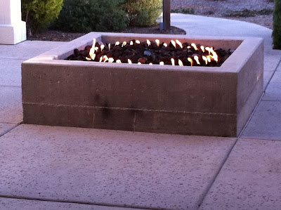
At one very chic, eco-conscious and rustically contemporary (is that a style? it is now) Napa Valley resort lives this charming concrete fire pit. This hearth is the heart of the outdoor "foyer" at the spa area; it is in the middle of a pathway, with no seating around it, so I'm guessing its purpose is not so much for literally warming oneself as for symbolizing the inner warmth the spa services nurture and awaken. I have a minor quibble with this — lowercase 'q' — because frankly, I enjoy sitting around a fire, and can't do that here without perching somewhat awkwardly on the narrow edge of the wall. (A typical depth for a seatwall would be about eighteen inches, to fit most posteriors comfortably; this is about six inches deep.) On the other hand, this might be intentional, to subtly discourage über-relaxed and probably slightly tipsy guests from sitting too close to an open flame.
What catches me more are a couple of aesthetic issues. I will grant up front that these may have been conscious choices; however, even if they were, I don't agree with them. First, in this clean and contemporary resort there are lots of straight lines, which the fire pit's square shape complements perfectly. The circular fire burner, however, has no precedent that I can see. Granted, the resort's logo is circular, but this is not carried into the architecture or landscape. What's more, the circle-within-a-square feels busy and disruptive, not calming, to me. A square burner would have been better, and more in keeping with the overall geometry of the place. Funny how such a little detail can have such a big effect.
 |
| Section view of a likely form for the concrete fire pit. |
Now, forming concrete is a talent I certainly do not possess. But the location of this seam annoys me. Could it have been a conscious design decision? There are other raised planters on the property with the same seam, but other than that I don't see any other precedent for dividing surfaces into 2/3 - 1/3 sections like this. And even if there were precedents, what does it mean? If it were an artistic statement, it should at least be intelligible. So I'm going to guess no, this wasn't an aesthetic choice. I'll guess it was a result of (a) going with the easiest solution to build; or (b) miscommunication between the landscape designer, who didn't specify how the forms should be built, and the builder, who didn't realize the aesthetic consequences of their methods.
If I were the designer, I like to think, I would have realized a seam would be inevitable (because there would need to be at least two rows of boards), and would have specified that the seam be centered on the wall. Yes, this probably would have meant using three rows of boards: a 2x12 top board ripped to be 9" tall (so the seam would be halfway down the 18" face), a 2x12 in the middle, and a 2x3 or 2x6 on the bottom.
This level of detail makes the construction much more complex in the short term. So does custom-fabricating a square burner. But in the long term — and we designers are paid for long-term, big-picture thinking — I think it would be worth it if no guest (not even a nit-picky designer) ever looked at this otherwise wonderful resort's fire pit or planters and thought, "Huh. That's weird."
 |
| One way to center the seam |
This level of detail makes the construction much more complex in the short term. So does custom-fabricating a square burner. But in the long term — and we designers are paid for long-term, big-picture thinking — I think it would be worth it if no guest (not even a nit-picky designer) ever looked at this otherwise wonderful resort's fire pit or planters and thought, "Huh. That's weird."
1 comment:
I hear 'ya talkin'. It's one thing if it's a home made project utilizing "off the shelf" solutions by an inexperienced slob (such as myself). But when you're paying a professional for bespoke (I've always wanted to use that word in a sentence) piece, it's laziness on the designer's/contractor's behalf to create something this sloppy.
Post a Comment